Marketing page
Because this was a brand new feature we created a marketing page to introduce the tool which the user would land on the first time they came to the page whether from other marketing channels or by stumbling upon it. The next time they arrived at this portion of the dashboard they would go directly into the tool with the ability to navigate back to this page if they so desire. This explains the benefits to using the tool and how it works.
myProject Tool
The tool is setup as a series of cards that you open to reveal details and interact with the project. The cards are colour coded to indicate levels of completeness and are organized as such so that at a glance the user can see which projects are in flight and which need to be completed.
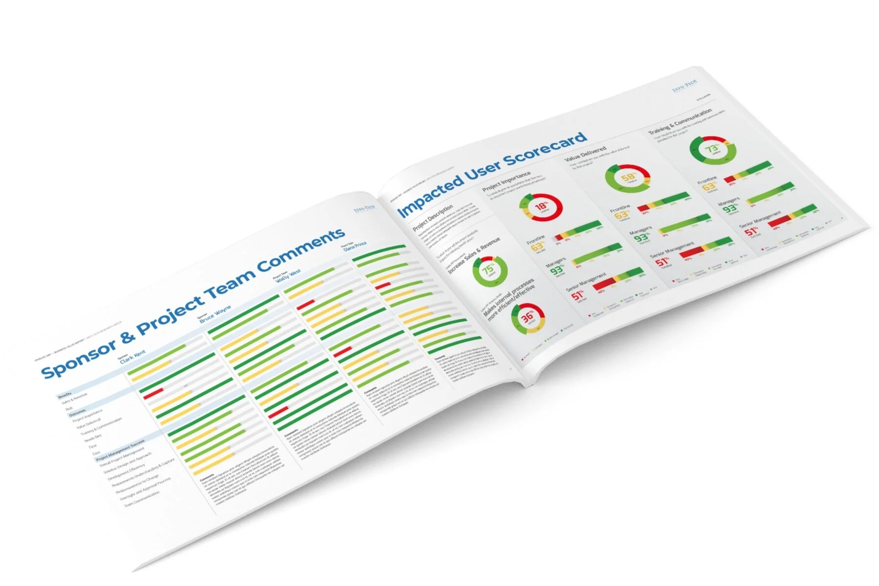
PDF Diagnostic Report
After data has been collected on each project a pdf is generated using visuals to show findings. These are boardroom-ready documents that our users ask for in order to present to their stakeholders.


